Let’s be honest, your contact page is probably the most neglected part of your website. But what if I told you it could be your secret weapon for building trust and boosting sales? You’re in the right place, my friend.
If you don’t have a solid contact page you’re missing out on a golden opportunity to build trust, answer customer questions, and even boost your sales.
In this post, I’ll walk you through why a contact page matters, how to create one in Shopify, what to include to make it as effective as possible, and some real-life examples to inspire your own. Let’s do this!
Why Your Contact Page is a Big Deal
“Do I really need a contact page?” “Can’t people just DM me on Instagram?” These are literally the top comments I hear from new shop owners all the time. And I get it! When you’re just starting out, it feels like overkill.
But here’s the deal – yes, you absolutely need one, and yes, they can DM you, but not everyone hangs out on social media 24/7. Plus, having a dedicated contact page for those “I’m-this-close-to-buying-but-have-one-question” moments? It converting browsers into buyers.
Here’s why having a contact page matters (even if you think it doesn’t):
- Builds Trust – Would you buy from a website that seems impossible to reach anyone? Me neither! Customers feel wayyyy more confident buying when they see clear contact info. It shows them there’s a real human behind the business who won’t disappear with their money.
- Improves Customer Service – The truth is that most people are too lazy to read your entire FAQ section (no judgment, I do the same thing). A contact page gives them a direct line to ask their specific questions. Bonus points if you add a chat box – I’ve got a complete video tutorial for this on my YouTube channel called Shopify Inbox App Step by Step Tutorial.
- Increases Sales – when someone’s ready to buy your amazing product but has one quick question about… xyz. They can’t find how to contact you, so they think “eh, I’ll just find something similar elsewhere.” Boom – sale gone! A contact page prevents these almost-sales.
- Boosts SEO – So I’ve heard that Google actually rewards businesses that look legitimate. Having a contact page with your real business details signals to Google that you’re not some fly-by-night operation. This builds credibility AND helps your search rankings. Win-win!
How to Create a Contact Page in Shopify (2025)
Alright, let’s get into the fun stuff. Shopify makes it easy to create a contact page, even if you’re not techy, you can do this. Here’s how:
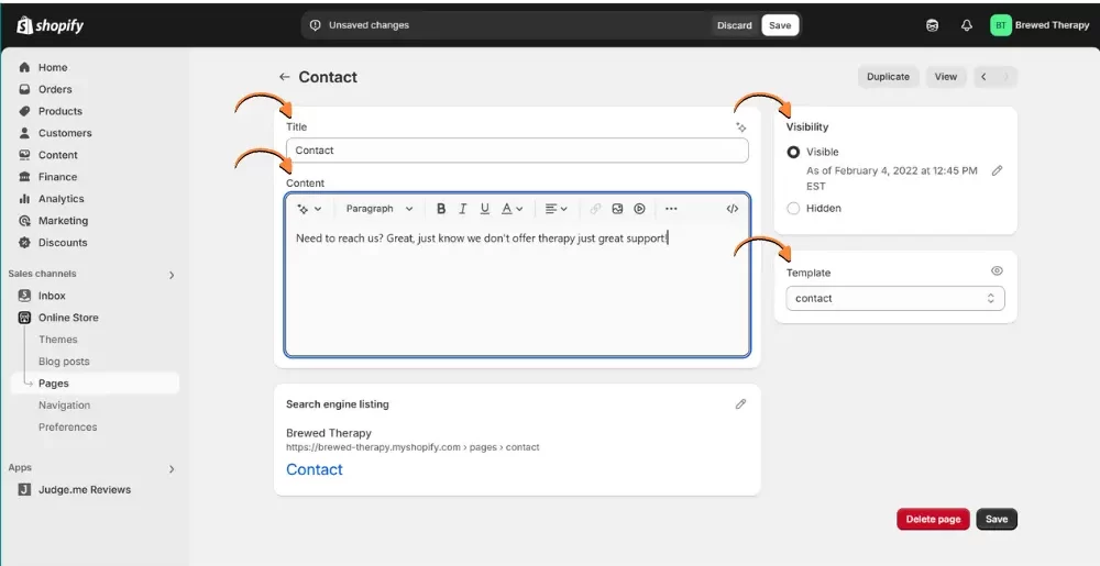
Step #1 Build Your Contact Page
No coding required! Just follow these steps:
- Log into Shopify and go to your Admin Dashboard.
- Click on Online Store > Pages.
- Click the “Add Page” button (top right corner).
- Give your page a title like “Contact Us” or “Get In Touch” (I personally like “Let’s Chat!”)
- In the Content box, you can add a short, friendly message like:
“Got a question? We’re here to help! Fill out the form below, and we’ll get back to you ASAP.” - Make sure “Visible” is selected (kind of important if you want people to see it 😉)
- Here’s the magic part – select “contact” from the Template dropdown menu. This automatically adds a basic contact form.
- Click Save. You’ve got the basics done 🎉
Step #2 Add the Contact Page to Your Navigation
Let’s make sure people can actually find your new contact page:
- Go to Online Store > Navigation.
- Select the “Footer menu” (or wherever you want the link to live)
- Click “Add menu item”
- For the Label: Enter the text you want to appear in the menu link (e.g., “Contact Us”).
- For the Link: Search for and select the contact page you just created.
- Save it.
Step #3 Customizing Your Contact Page
This is where you can really let your brand shine! Shopify’s theme editor allows you to customize the look and feel of your contact page. You can change the colors, fonts, and layout to match your overall website design. Pay special attention to mobile responsiveness – make sure your contact page looks great on all devices.
Here’s how to add sections:
- Go to Online Store > Customize.
- Look up at the top for the page template dropdown – choose your new “Contact Us” page
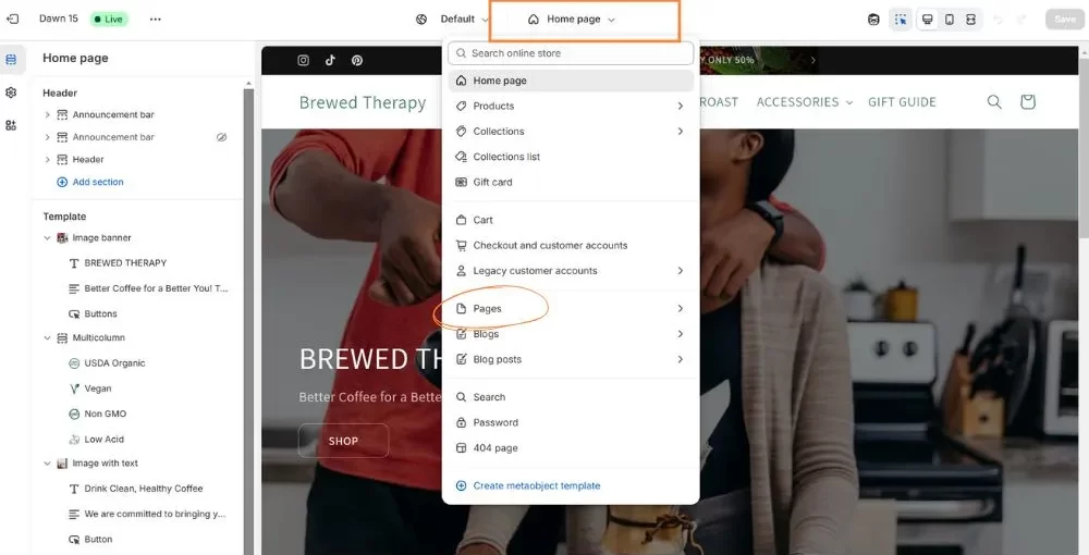
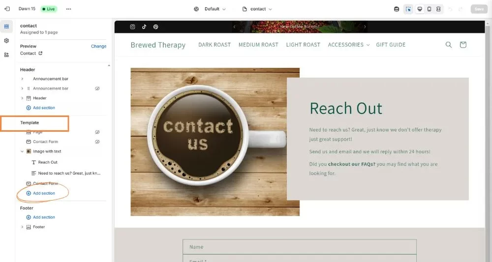
- Time to add some sections! Click “Add section” in the left sidebar in the Template section. The available sections will depend on your theme.
- Once you are done designing your page, review the mobile version to ensure everything looks good.
- Don’t forget the Save your work.
Now you’ve got options (depending on your theme):
- Business Info: Use “Rich text” or “Image with text” sections to share your location, phone number, hours, etc.
- FAQs: The “Collapsible content” section is perfect if your theme doesn’t have a dedicated FAQ section
- Social Media: Most themes have a “Social Media” section – if yours doesn’t, “Rich Text” works too
- Instagram Feed: Want to show off your latest posts? You might need an app for this one is your theme doesn’t provide one.
PRO TIPS:
- Want to customize those default placeholder text in the form fields? Check out my super quick video tutorial HERE – it takes literally one minute!
- If you want full customization of the contact form, Hulk Form Builder is a great app, available in the Shopify App Store.
Weekly emails for eCommerce shop owners!
Tips, Tricks & Resources to Design, Maintain, and Grow Your eCommerce Store.
What to Include on Your Contact Page
Now that your page is up and running, let’s make sure it has everything your customers need:
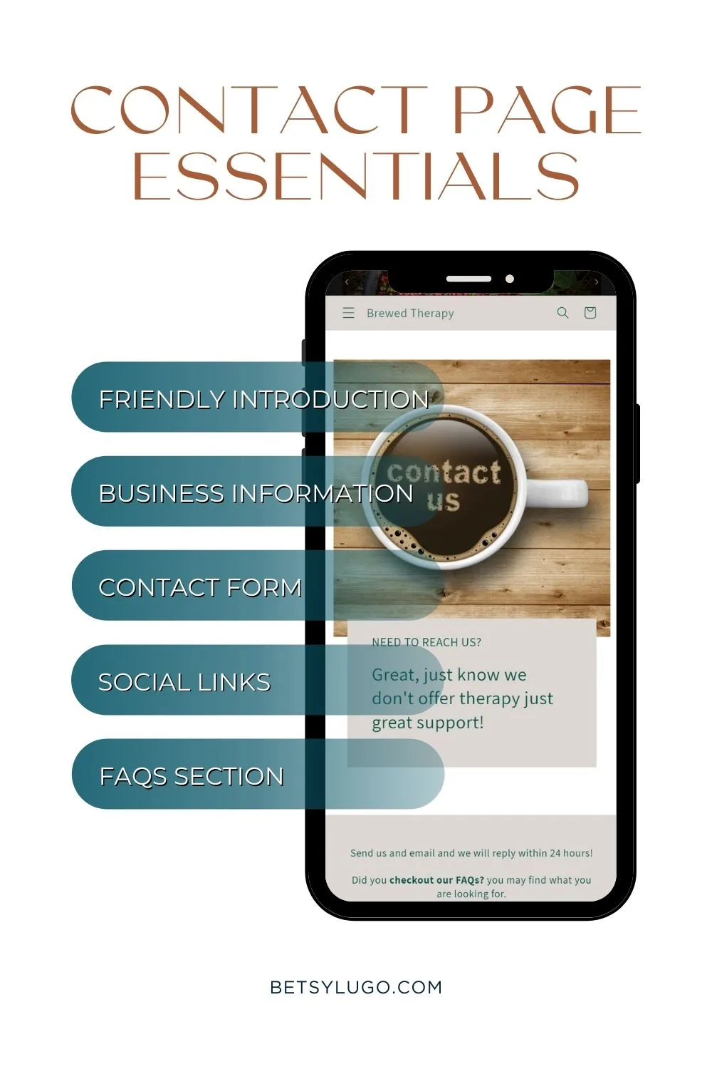
#1 A Friendly Intro
An introduction is always nice – it’s your chance to set the tone. Here are a few options, depending on your brand personality:
- Playful: “Hey there! Got questions? We’re actual humans who love to help!”
- Professional: “We’re happy to assist you. Please fill out the form below, and we’ll get back to you promptly.”
#2 Contact Form
Name, email, phone number (optional), and a message box are the basics. Keep it simple!
Add a confirmation message like “Thanks! We’ll get back to you within 24 hours” so people aren’t left wondering if their message disappeared into the internet void. And if you’re a one-person show who only answers emails during naptime (been there!), be upfront about it. Your customers will appreciate the honesty.
NOTE: Some people prefer emailing directly instead of filling out a form. So consider adding a direct email address too.
#3 Social Media Links
If you’re active on Instagram, Twitter, or any other socials drop those links so customers can connect with you. Many prefer sliding into DMs over formal emails. Plus, this gives them a chance to see more of your brand personality before they buy.
#4 Business Locations & Hours
If you have a physical location include your address, phone number, and when you’re actually open. Adding a Google Maps embed is super helpful for customers trying to find you – makes a big difference.
#5 FAQs (Optional but Seriously Helpful!)
Want to save yourself from answering “Do you ship to the PO Boxes?” for the 100th time? Add a FAQ section! This helps customers get immediate answers to common questions, which means fewer abandoned carts and more happy shoppers. You can either add a few questions directly on your contact page or link to your full FAQ page if you have one.
5 Tips for a Great Contact Page
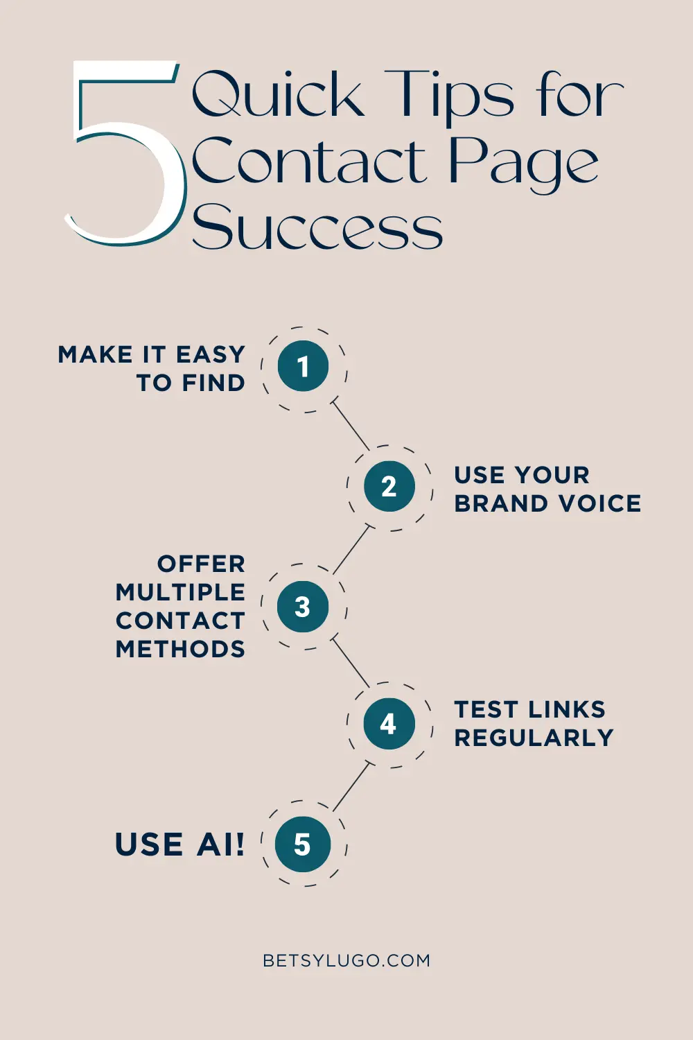
Here are a few extra tips to make your contact page work harder for your shop:
👀 Make It Easy to Find – Nothing’s more frustrating than hunting for contact info! Add your link in the footer, and even drop it on product pages. Trust me, customers appreciate when they don’t have to play detective.
📣 Use Your Brand Voice – If your brand is fun and quirky, don’t suddenly get all corporate on your contact page! Your personality should shine through from the first line. Think about it – would you rather message a person or a robot?
🗒️ Keep It Simple – I’ve abandoned so many forms that asked for my life story. Stick to the basics: name, email, and what they need help with. You can always ask for more details later!
💬 Include Multiple Contact Methods – Some folks hate forms, others prefer phone calls. Give options! Email, form, chat, carrier pigeon (kidding!)… just make sure there’s a way that works for everyone.
🛑 Test It Regularly – Nothing kills trust faster than a broken contact form. I actually found an error in my calendly form just a few days ago. Send yourself a test message to ensure it’s working correctly.
🤖 Let AI Help You – Shopify Inbox, check out my tutorial here, is seriously a lifesaver for small shop owners. It’s free and answers basic questions automatically using info from your own site. It will reduce your emails, plus customers get instant answers instead of waiting for the next day, for those of us shopping at 2 AM!


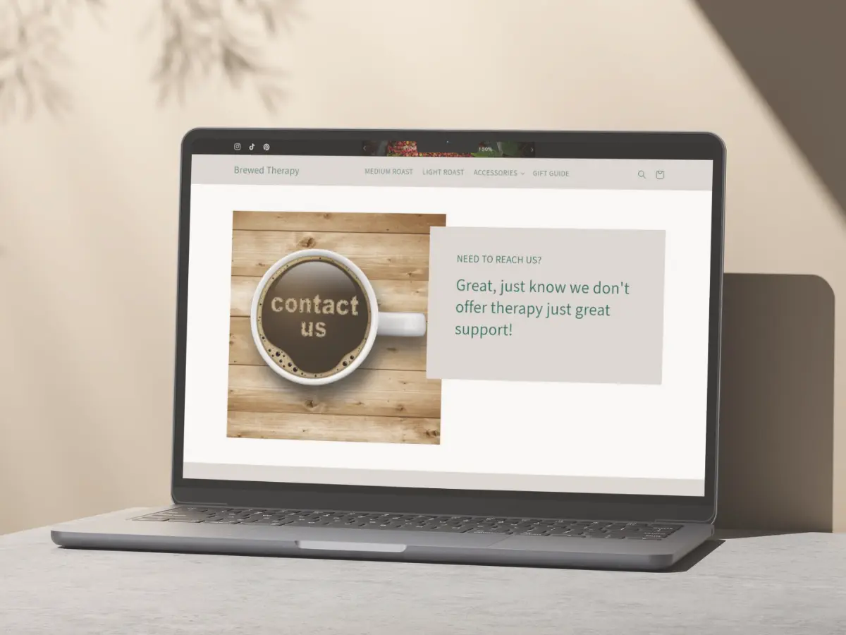
3 Contact Page Examples to Inspire You
I am a visual person, so here are 3 contact pages that nail the perfect balance of functionality and personality, in my opinion lol:
#1 Lululemon
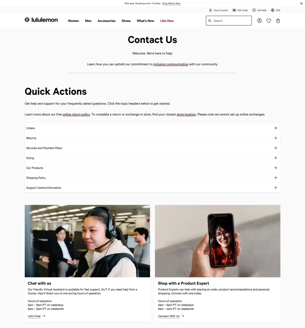
Lululemon’s contact page is a user-centered design. It’s detailed yet clean, avoiding the cluttered feeling that can overwhelm visitors. What stands out most is how they’ve organized different types of inquiries (returns, product info, general questions, etc.). This clear categorization directs customers to the right resource quickly, minimizing frustration and wait times.
Key Takeaway: Think about the common reasons people contact you and create clear pathways for them to find the specific help they need. This shows you value their time and makes it easier for your team to manage inquiries efficiently.
#2 Black Girl Sunscreen
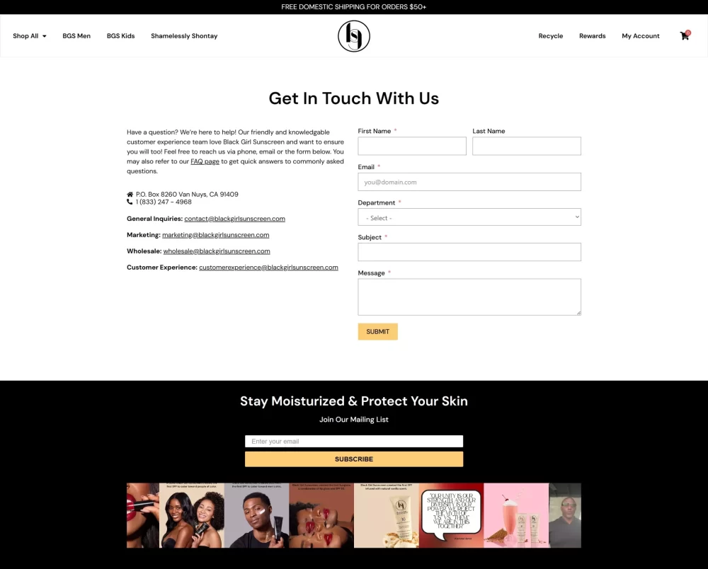
Credit: Black Girl Sunscreen.
Black Girl Sunscreen takes a different approach, opting for a simple design that directly provides email addresses for various departments. This directness resonates with their target audience, who likely appreciate the easy access and personal touch. Including their Instagram feed is a smart move, as it allows visitors to see their brand personality and connect with them on a more informal platform.
Key Takeaway: Consider your target audience and how they prefer to communicate. Sometimes, a simple and direct approach is the most effective. Don’t be afraid to leverage your social media presence to connect with your audience on a more personal level.
#3 Sephora
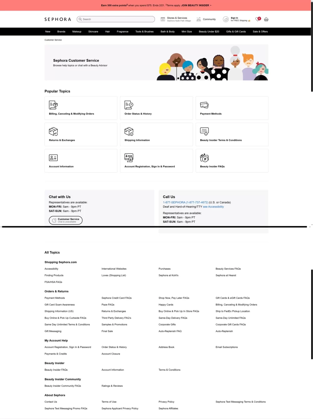
Sephora’s contact page is comprehensive but easy to navigate. It emphasizes choice by offering a variety of contact methods: chat, app, and phone number with hours of operation. Listing all the topics in a clear and easy-to-find format is very helpful. This caters to different customer preferences – some prefer the immediacy of chat, while others might prefer a phone call.
Key Takeaway: Offering multiple contact options ensures that customers can reach you in the way that’s most convenient for them. This inclusivity can significantly improve customer satisfaction.
What Can You Learn From These Examples?
These examples demonstrate that contact pages aren’t just about having a form. They’re about creating a positive experience for your customers. Here are some questions to ask yourself as you design your own contact page:
- How can I make it as easy as possible for customers to find the information they need?
- What are the most common reasons people contact me, and how can I streamline those inquiries?
- What communication channels does my target audience prefer?
- How can I inject my brand personality into my contact page to make it more engaging?
Take what resonates with you from these examples (and others you find) and adapt it to your own shop. Remember, your contact page is an extension of your brand, so make it count!
Ready to transform your contact page?
Know that your contact page isn’t an afterthought, head over to Shopify now and start building! And don’t forget to share your new contact page in the comments below – I’d love to see what you create!
P.S. If you found this helpful, I’d love if you’d share this post with a business bestie who might need it. We’re all in this together!
📌 pin this guide for reference to your Shopify Board on Pinterest! 👍🏽