Post Updated: February 8, 2025.
Want to give your Shopify store a polished mobile look? This guide shows you how to control which sections appear on desktop and mobile – no coding experience required! Perfect for themes like Dawn that lack built-in mobile editing, this simple CSS trick lets you tailor your site for every screen.
What you’ll learn:
- Hide desktop sections on mobile for a streamlined experience.
- Create mobile-specific sections for a personalized mobile journey.
- Easily implement these changes with copy-and-paste CSS.
Prefer to watch? 👇🏽
Hide a Desktop Section on Mobile
STEP 1: Open the Theme Customizer.
Begin by accessing the Customizer of your website. This is where you’ll make the necessary changes to hide or display sections based on the device.
In your Shopify admin, navigate to the theme editor and click on Customize.
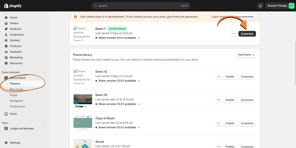
STEP 2: Select the section you want to hide.
- Select the section you wish to hide on mobile.
- Scroll to the button to access the “Custom CSS” section
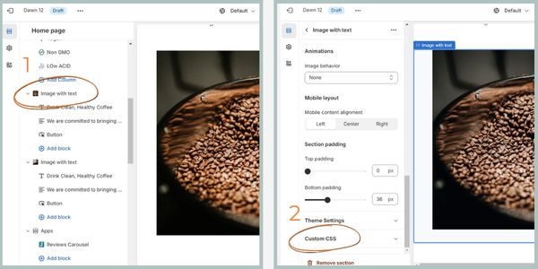
STEP 3: Add CSS.
Paste the CSS code below in the the Custom CSS section
@media screen and (max-width: 751px) {
   {
    display: none !important;
  }
}
Understanding the Code:
This code uses a media query, which tells your website how to style content based on the screen size. In this case, the @media screen and (max-width: 751px) part targets screens with a maximum width of 750 pixels (typical mobile screen size).
The display: none !important; rule hides the section by making its display invisible on these screens. The !important part ensures the rule overrides any other styles that might conflict with hiding the section.
STEP 4: Save and View.
Save your changes and preview your website to see the desktop and mobile versions. The desktop section should be hidden on mobile.
Create a Mobile-Specific Section
STEP 1: Open the Theme Customizer.
Begin by accessing the Customizer of your website. This is where you’ll make the necessary changes to hide or display sections based on the device.
In your Shopify admin, navigate to the theme editor and click on Customize.
STEP 2: Add/design a section for mobile.
Add the desired section, edit the content to be mobile-friendly (e.g., use a vertical image).
STEP 3: Add CSS.
In the section, scroll to the button to access the “Custom CSS” section. Then paste the CSS code below in the the CSS section.
@media screen and (min-width: 750px) {
   {
    display: none !important;
  }
}
Understanding the Code:
This code snippet utilizes a media query as well. Here, @media screen and (min-width: 750px) targets screens with a minimum width of 750 pixels. This means the code applies to screens wider than a typical mobile device (around 750px).
The display: none !important; rule hides the section on these screens. This is typically used in the mobile-specific section code to ensure it’s hidden on desktops and larger screens. The !important part again guarantees this rule overrides any conflicting styles.
STEP 4: Save and View.
Save your changes and preview your website to see the desktop and mobile versions. The desktop section should be hidden on mobile.
Bonus Tip:
Experiment with different breakpoints (e.g., min-width: 900px for tablets) to find the optimal viewing experience for various screen sizes.
Weekly emails for eCommerce shop owners!
Tips, Tricks & Resources to Design, Maintain, and Grow Your eCommerce Store.
Finding Your Theme’s Breakpoint
The general breakpoint of 750px is what I use for the Dawn theme. However, some themes might have different breakpoints. To locate your theme’s specific breakpoint:
- Go to “Online Store” > “Themes” in your Shopify admin.
- Click “Actions” > “Edit code”
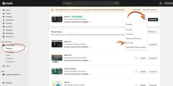
- In the “Assets” folder, locate the “base.css” or “theme.scss”
- Search for “@media” using the search function Ctrl + F.
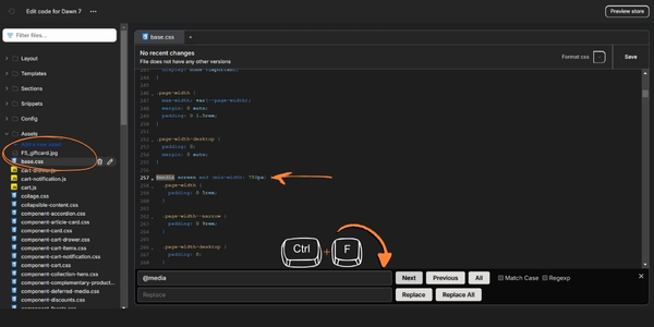
- Look for media queries related to screen width. This will reveal the breakpoint used by your theme.
Enjoy the Flexibility! With this basic CSS technique, you gain more control over your Shopify website layout. Remember to tailor the code and breakpoints to your specific needs and theme.
Let me know if you have any questions.
YOU GOT THIS!
Betsy

FAQs
Why would I want to hide sections on mobile devices?
Hiding certain sections on mobile devices can help optimize the user experience by removing clutter or content that may not be relevant or display well on smaller screens.
Can I use this method to show different content on mobile and desktop?
Yes, you can use this method to show different content on mobile and desktop by duplicating sections and customizing them separately for each device.
Do I need coding experience to implement this tutorial?
No, you don’t need coding experience. The tutorial provides simple CSS code that you can copy and paste into your website’s Customizer.
Can I hide specific elements within a section instead of hiding the entire section?
Yes, you can target specific elements within a section using CSS selectors. This allows for more granular control over which content is displayed or hidden on different devices.


2 Comments
Fantastic post however , I was wanting to know if you could write a litte more on this topic? I’d be very thankful if you could elaborate a little bit more. Thanks!
Will do! Thank you for the feedback.